Planwisely’s new interface has LAUNCHED!
23 November 2022
We are super excited to announce that Planwisely’s platform has had a makeover! At Planwisely they aim to develop a world-class urban analytics platform that is simple to use and provides the best possible experience and insights to our users…within seconds!
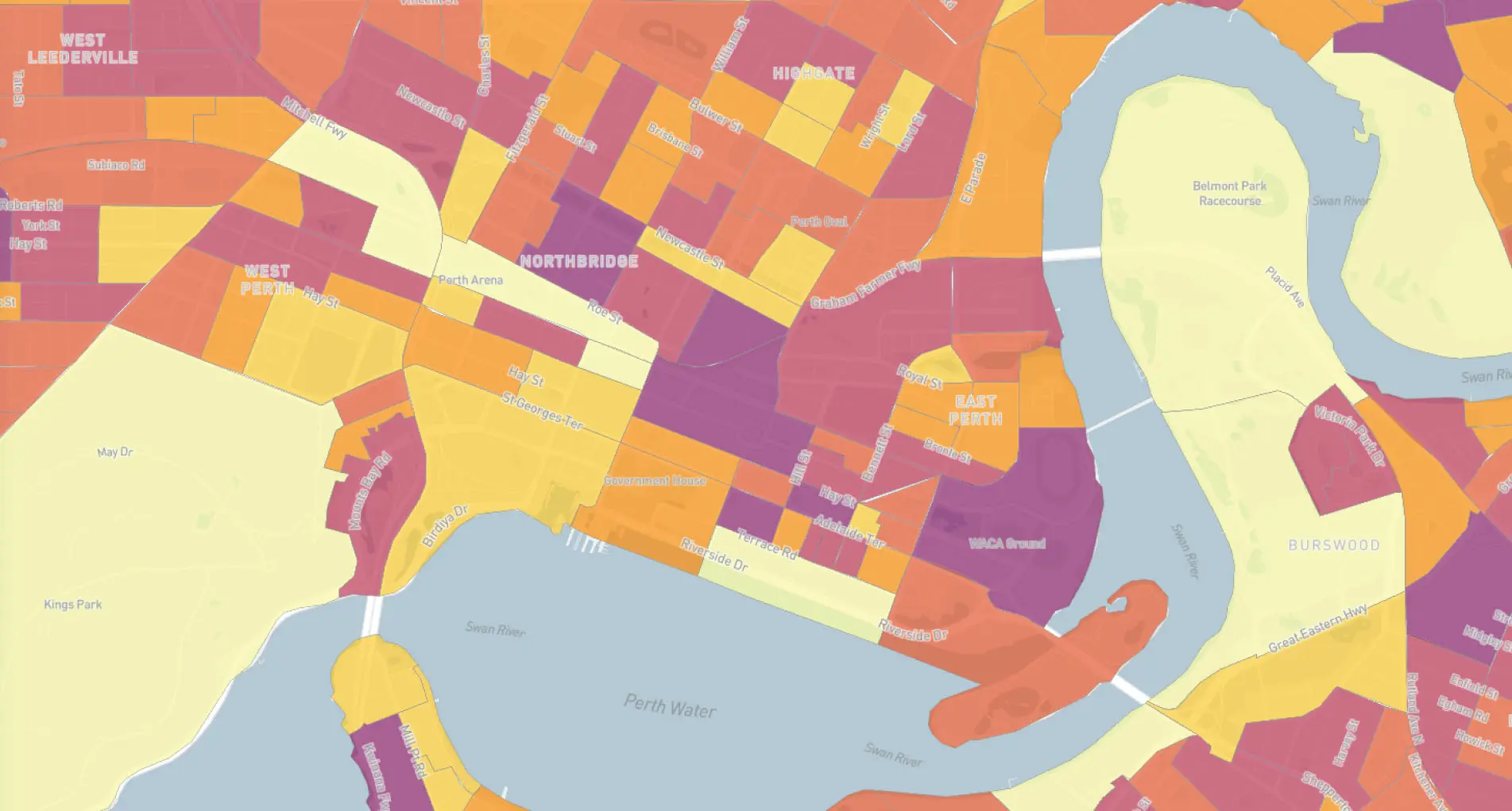
The new interface provides a modern look and feel, with improved navigation, layout and much more. More importantly, the new interface maximises the mapping real estate, enabling users to generate amazing maps and insights for their respective presentations and projects.
WHY WE DID IT
Let your map do the talking
The new interface includes a cleaner look with consolidation of most features and functionality on the left-side bar. This allows for more map real estate so the user can gain better insights with the data.

Find things quickly
Simple enhancements such as labels on icons have been added to take the guess work out of all the features.
![]()
One location
By consolidating the majority of features on the left-hand side menu, users can easily find the account management, address search bar, help button and share function are also now all in one place.

We would love to hear your thoughts on the new Planwisely interface or your experience with the platform more generally. Reach out to us at enquiries@planwisely.io.