
Take a ride through Uber’s Movement data
31 August 2017
This morning, transport nuts all over the world are busy exploring the wealth of travel data which Uber collects from its customers. We’ve been holding out for this day since it was announced back in January, and it has finally arrived. Join me for a quick dive into what this data can do, and what you should be aware of.
What can it do?
Let’s start exploring! At the moment, the data for five cities are available, but we’re promised more will be rolling out soon. As it happens, VLC is opening an office on Kippax Street in Surry Hills this month, so that will make a great focal point for my investigation.
I’ll look at Tuesday to Thursday for standard weekday patterns. At this stage, Uber’s interface requires that we choose an Origin, but Destination is optional. In other words, travel is analysed from a location, rather than to a location. For this reason, I’ll analyse the PM Peak, so we can look at future trips home from our Sydney office. Hopefully some flexibility on this will be added soon.
Here’s the plot for weekdays in May 2017:
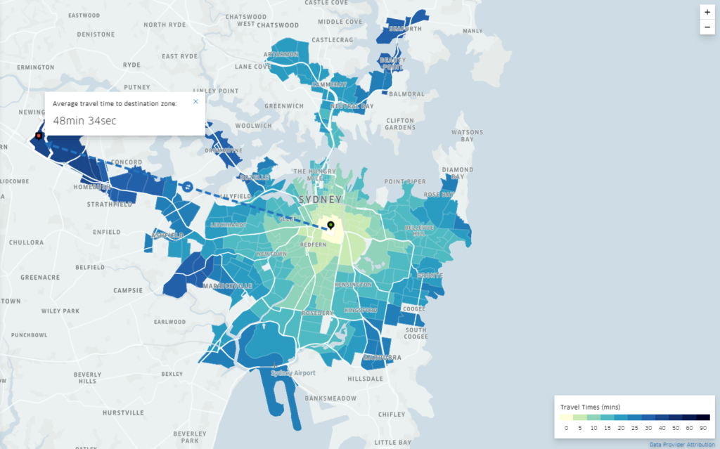
The longest trips displayed are under 50 minutes, while most of Sydney doesn’t display any data. This isn’t surprising – for privacy and data significance reasons, Uber has removed data for Origin-Destination pairs with insufficient sample sizes.
If you’re happy to pay tolls (and Uber/taxi customers generally are, seeing as they pay for time anyway), I imagine that trip to Silverwater will be a bit quicker now the M4 is tolled again!
Now let’s get interesting. May is a full-demand time period – no school holidays, no public holidays, university is in semester, and so on. Let’s see how much the holidays matter. The next plot compares May 2017 against Tuesdays to Thursdays from the 19th of December 2016 to 27th January 2017 (public school holidays in NSW):
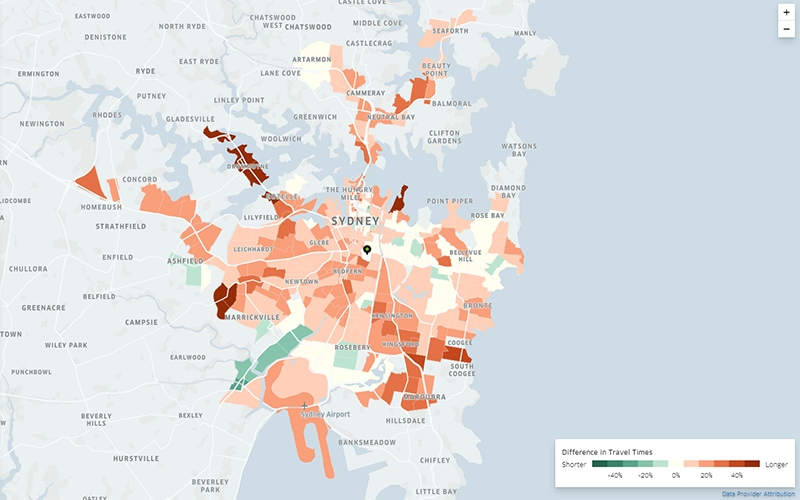
It looks as though travel times in full-demand periods are generally 10-30% worse than over the summer school holidays. Some locations are consistently worse, like Maroubra/Coogee, and destinations north of the Iron Cove Bridge. Interestingly, Tempe and St Peters seem to have better travel times in May. If someone from Sydney can comment on this, please go ahead – perhaps there were some major roadworks over the holidays? Or something more interesting going on?
Data geeks, read on. Let’s have a look at how this data is produced.
Limitations and data characteristics
Uber has released a white paper describing their processing. Some key points are:
- Zones are based on census tracts, traffic analysis zones, or neighbourhoods
- The raw data from which the Uber Movement dataset is generated is based on GPS pings with a 4-second interval
- Small samples are removed to protect privacy
- Travel times for each OD are not limited to trip origin-destinations, but generated from any trip which passes through these zones. This a complex point, so, from the white paper:

Unfortunately, the white paper gives no insight into the ‘Upper Bound’ and ‘Lower Bound’ values, which we’ll look into now to get a feel for variability of travel time. Given the Mean Epoch methodology above, and a lack of clarity on how those values are determined, it’s best not to draw any actual conclusions from the charts below. It’s just a good exercise to see what’s available!
We can download the data for the two date ranges we tested above for some external analyses. For these analyses, I’ve excluded trips under 4 minutes long – there is an awful lot of variability in this range (further indicating possible issues relating to the Mean Epoch methodology), and these aren’t really the point of this exercise anyway. I excluded one crazy outlier too. Each point on the plot represents a destination zone, with our new Sydney Office as the origin.
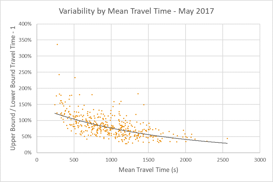
In this chart, 100% on the y-axis means the ‘Upper Bound’ travel time was double the ‘Lower Bound’ travel time. There’s a clear pattern of longer journeys having lower variability – but the Mean Epoch methodology will contribute to that.
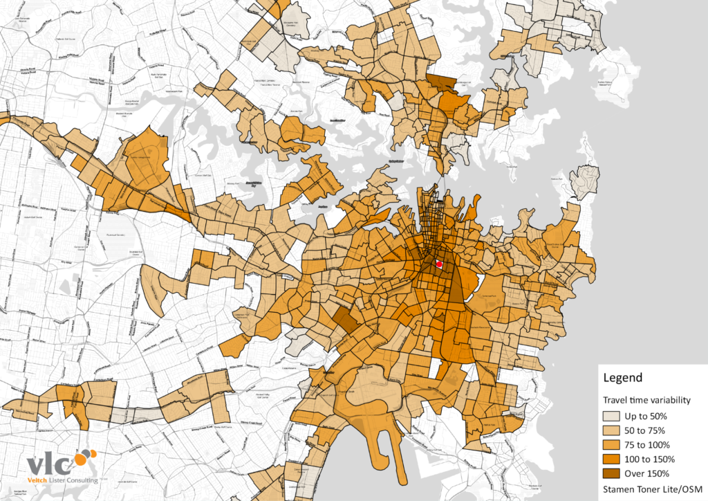
Looking spatially at daily data rather than just the PM Peak, we can see further evidence of the higher variability of short trips:
The next chart compares the May 2017 variability (y-axis in the chart above) against the same from the 2016/17 summer holidays:
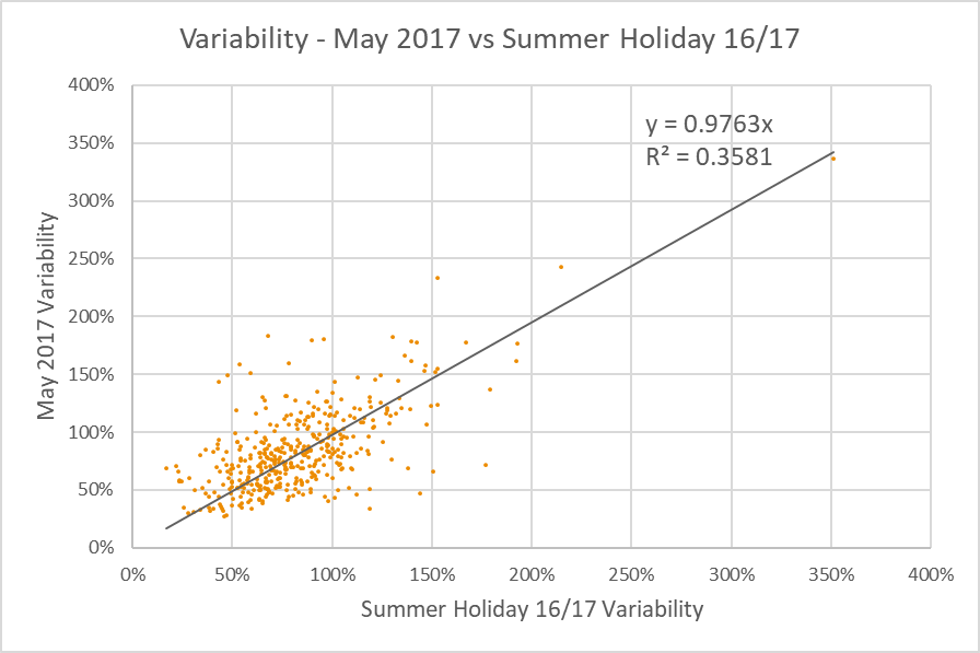
Now there’s an interesting chart. There are some significant differences in variability for individual OD pairs, but on the whole, variability was only very slightly lower during the summer holidays. At longer distances (generally the lower left corner of this chart), the impact of the Mean Epoch approach will be lower, and the outcomes more reliable, but there are still too many unknowns to be sure.
That was fun! I hope you enjoyed coming on that journey with me. Now, go and play with the data yourself, and let me know what you find.
Don’t forget!
The data is provided by Uber under a non-commercial licence. Fair enough. Don’t go using this in your paid work; you’ll be in big trouble.